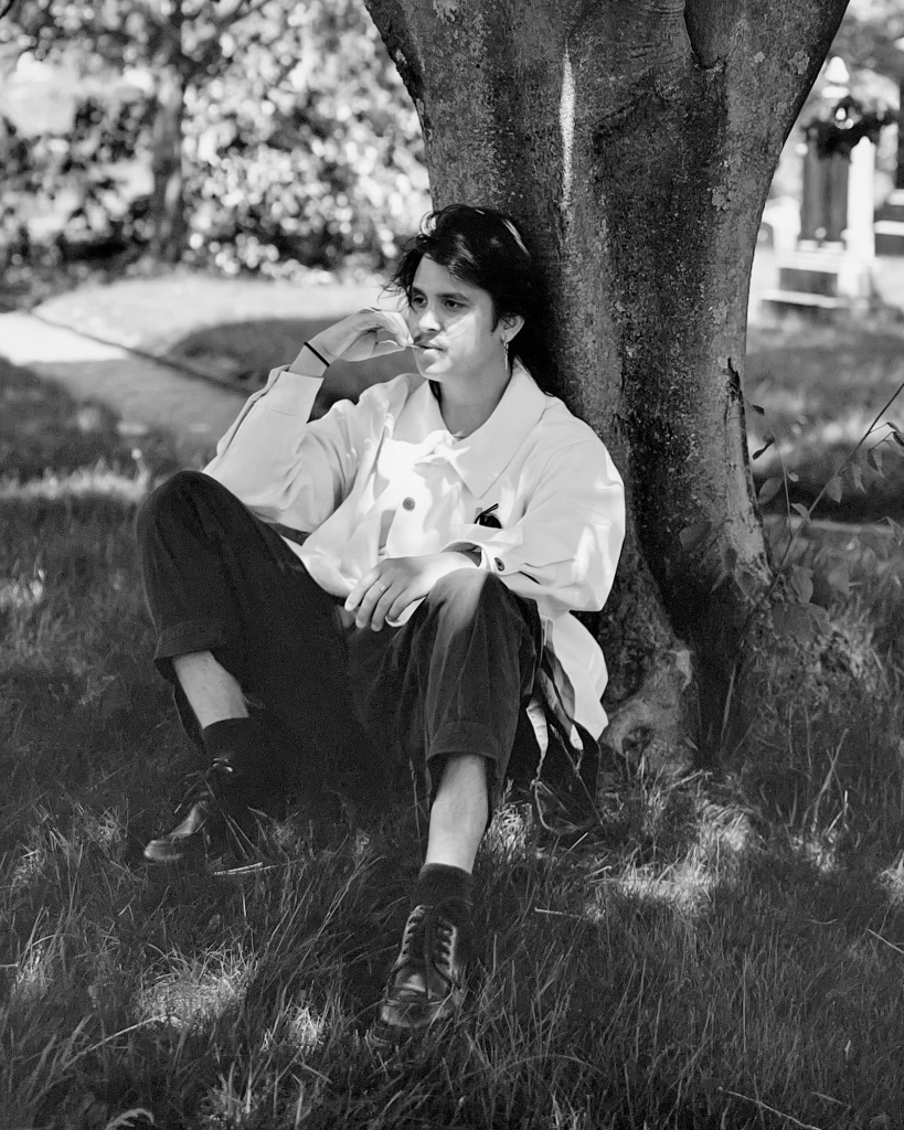
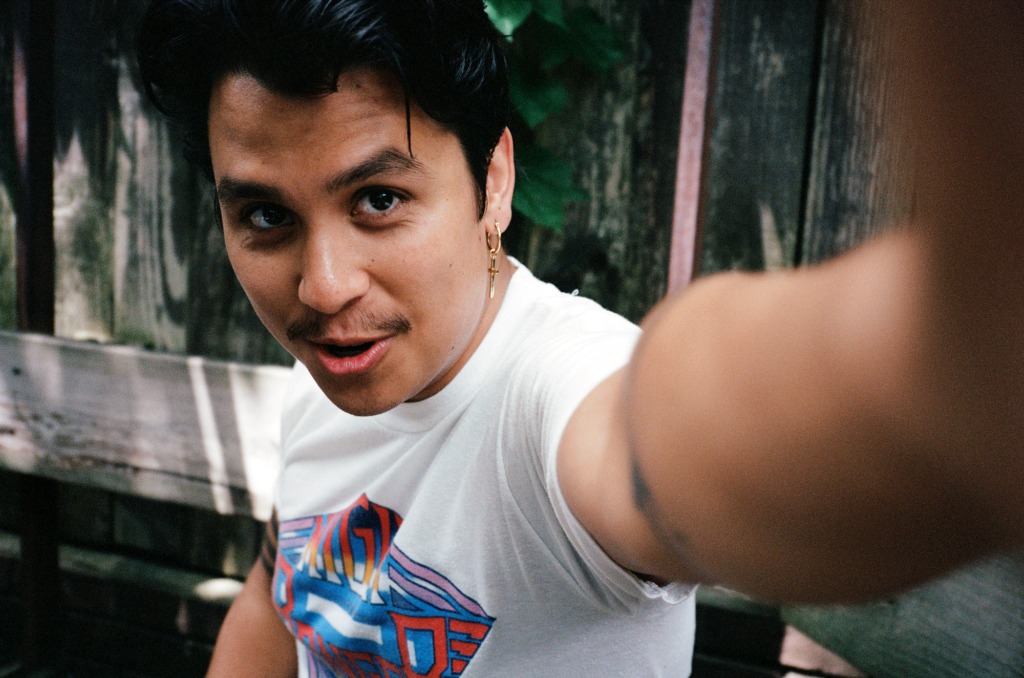
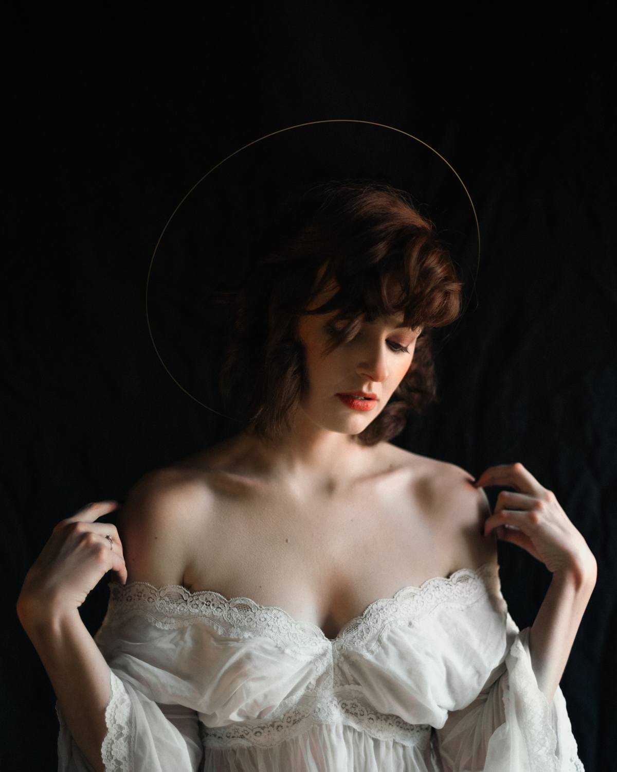
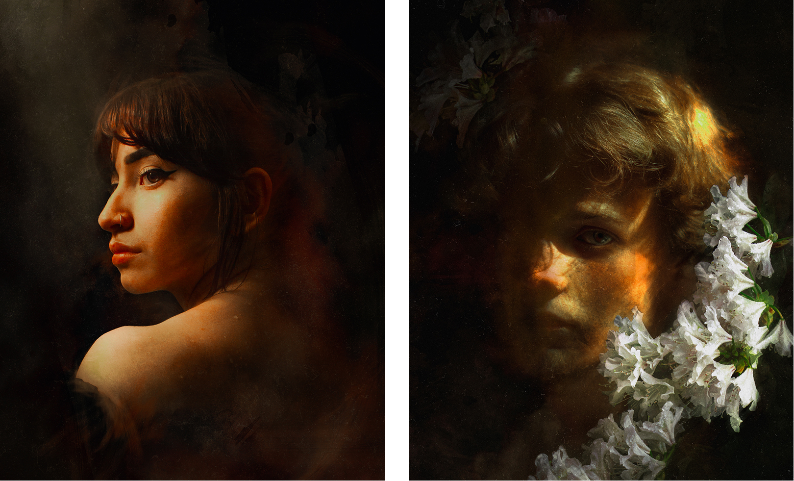
Ornamental chandelier Borromean rings Angel
enttäuscht Ankh symbol
Ouroboros Hand with snake

AUGUST HOUSTON

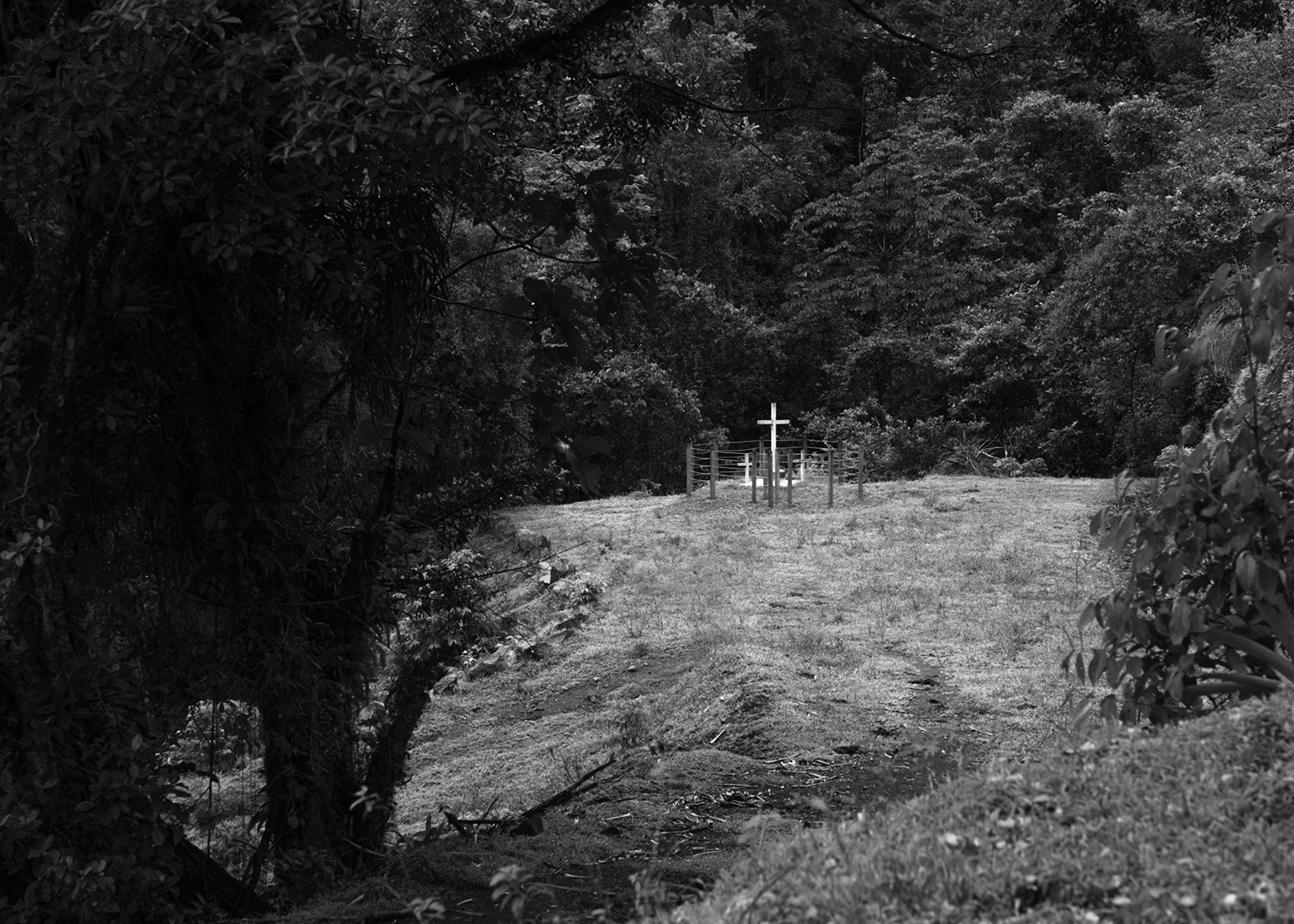
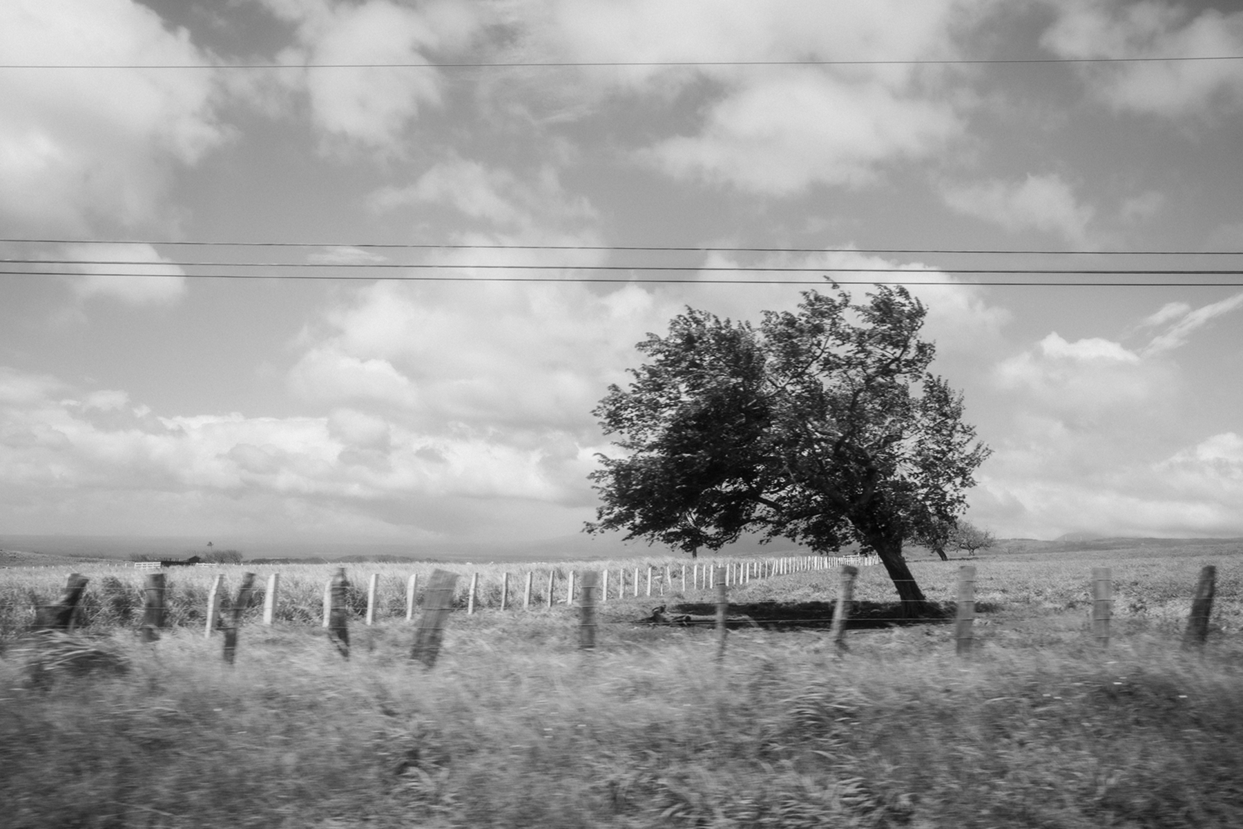
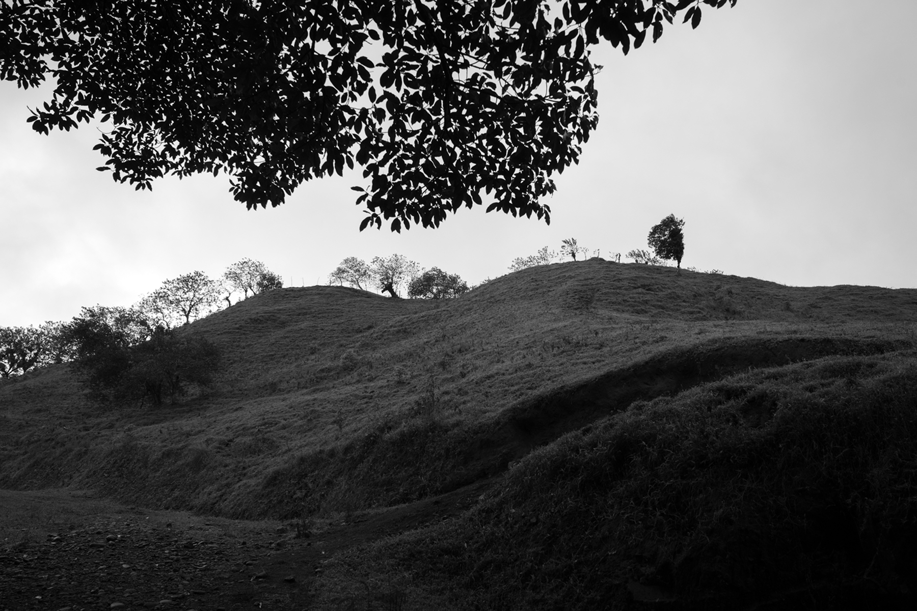
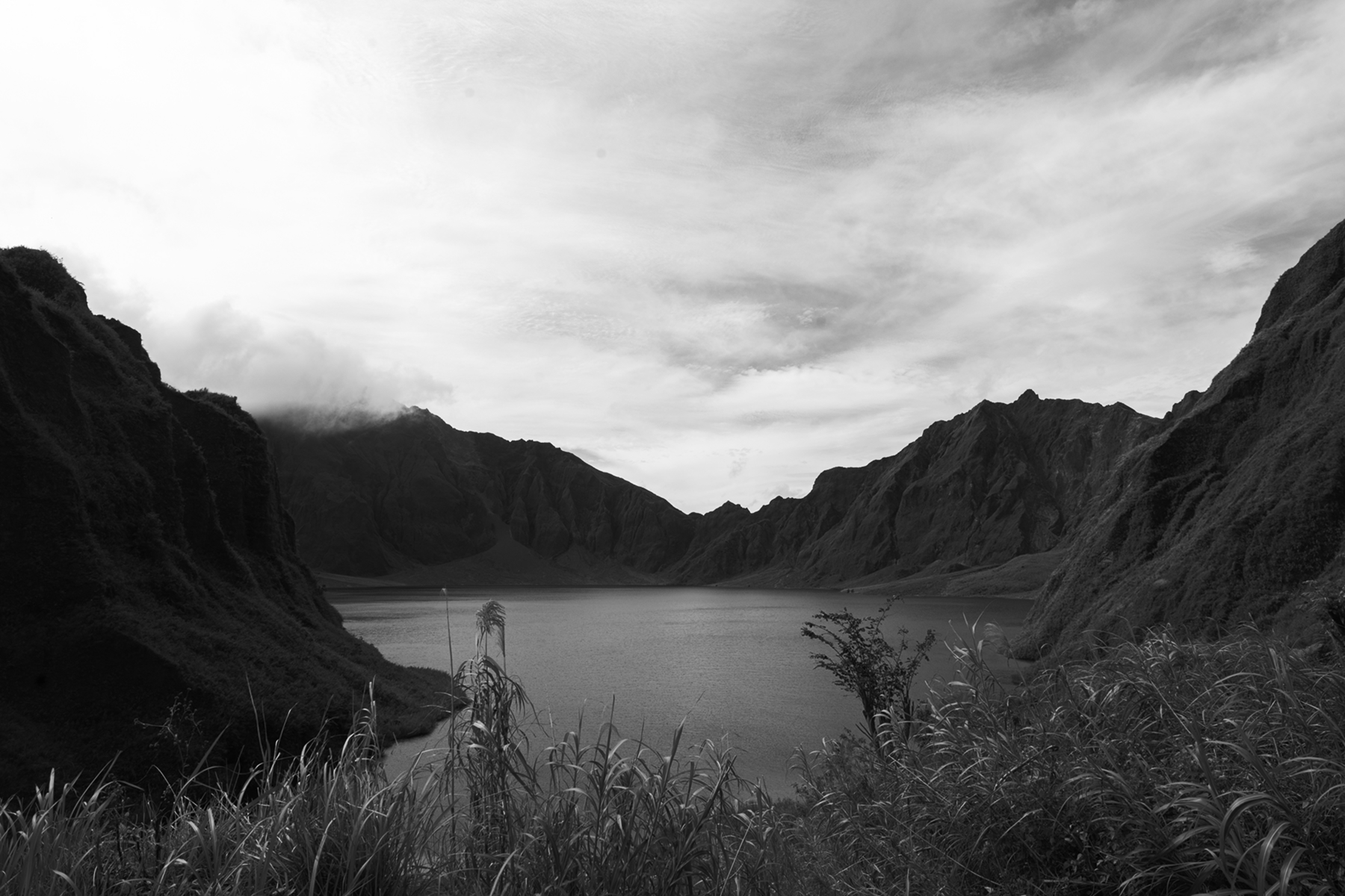
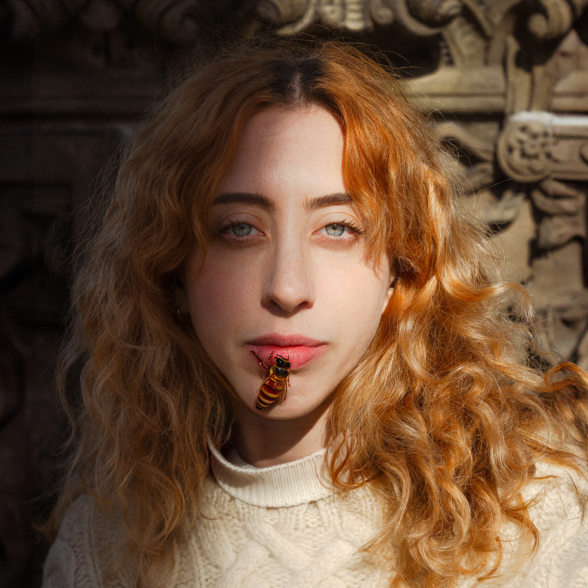
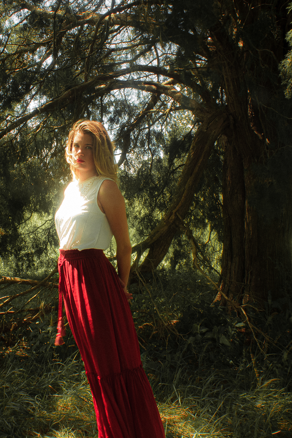
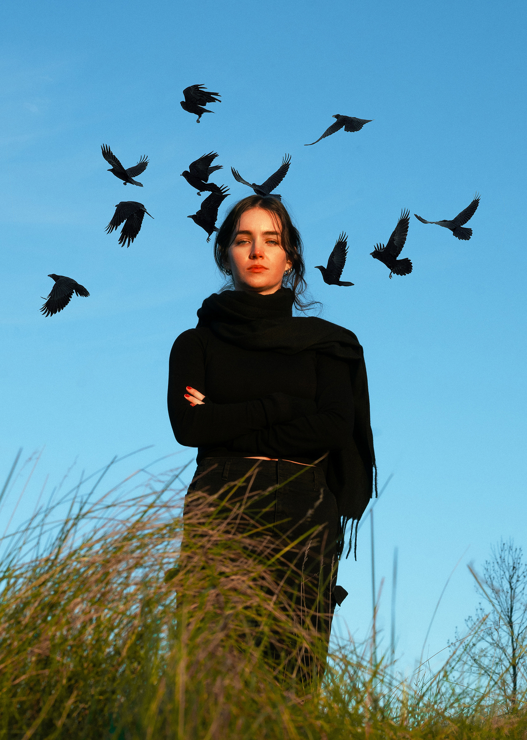
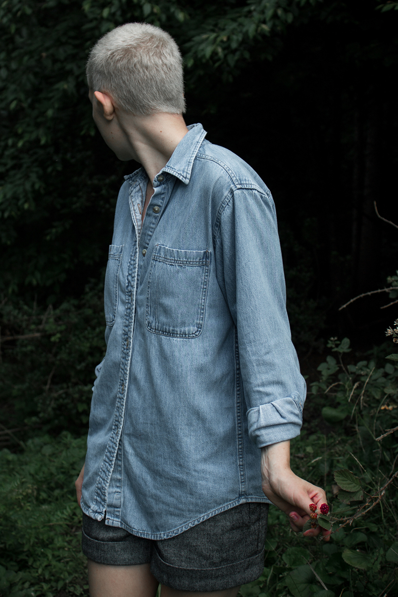
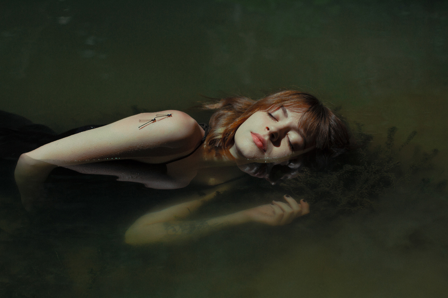
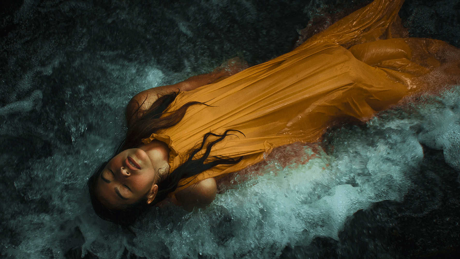
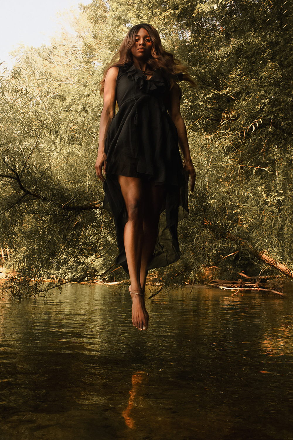
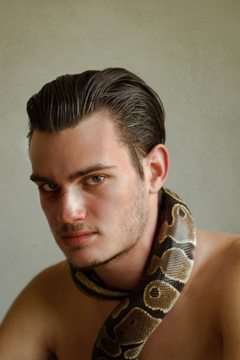
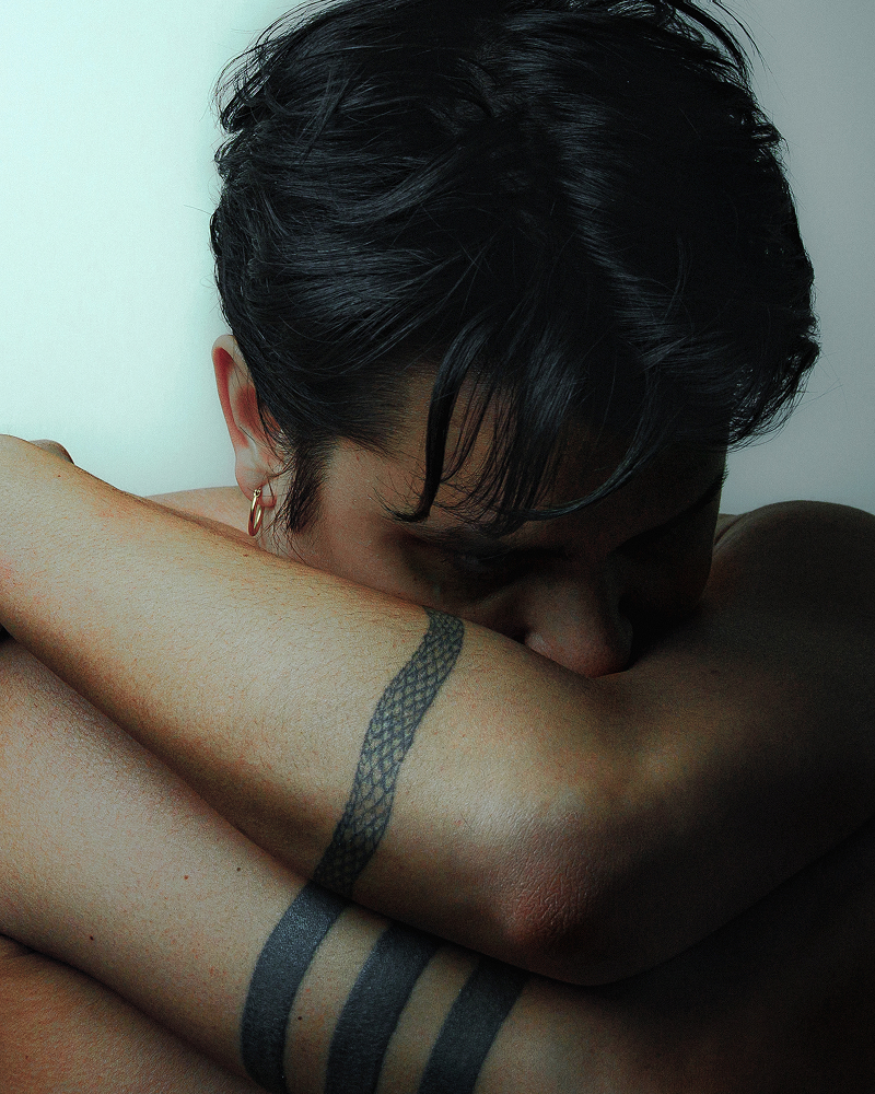
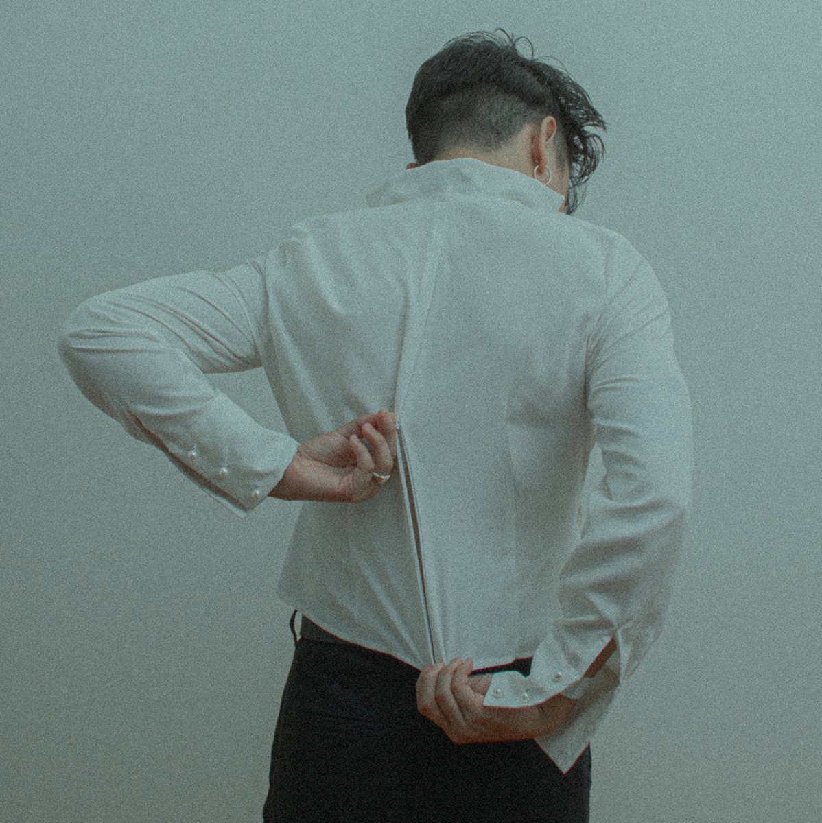
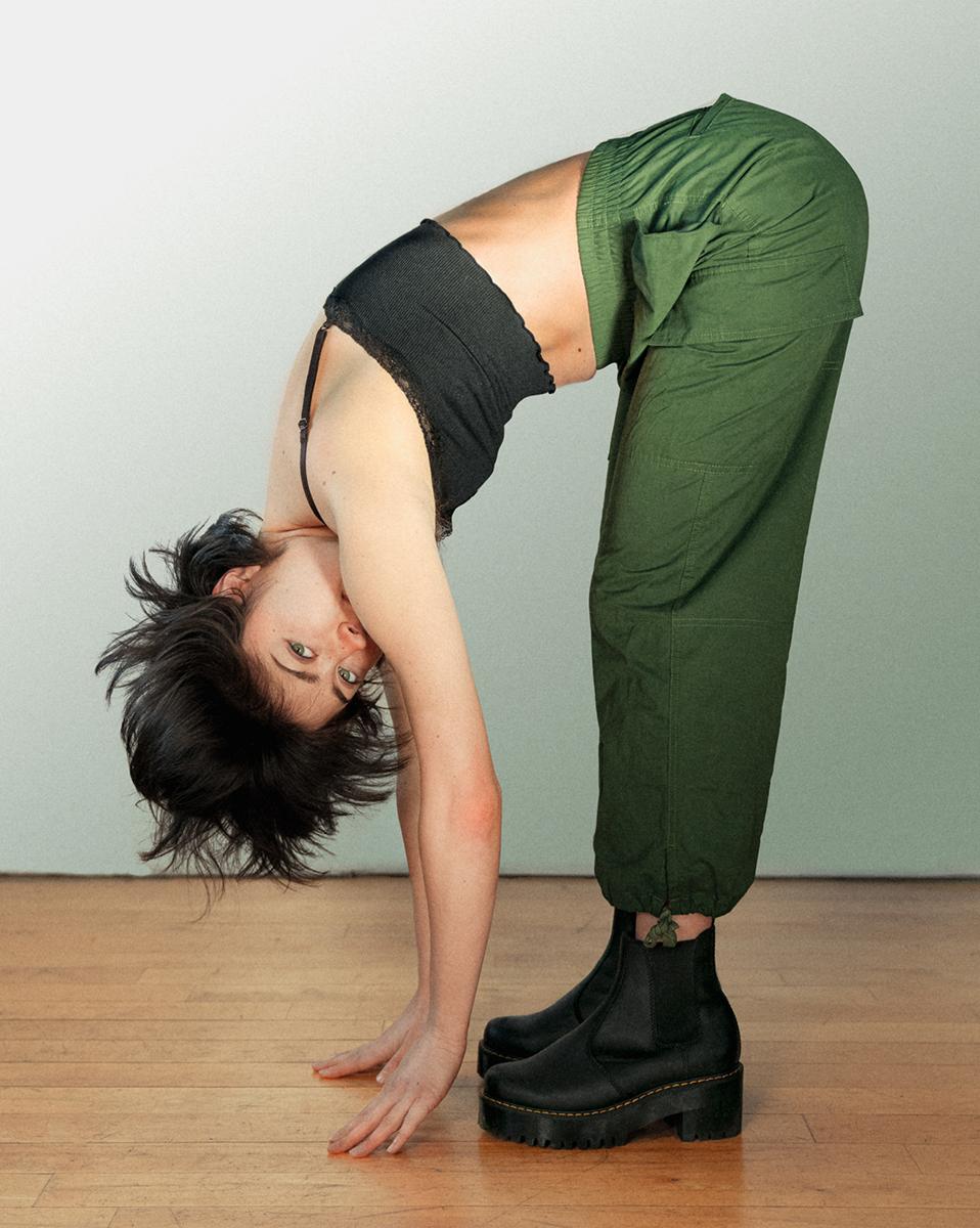
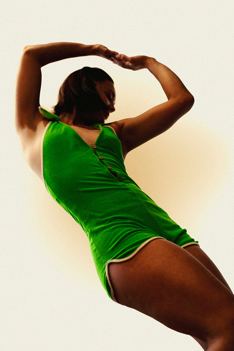
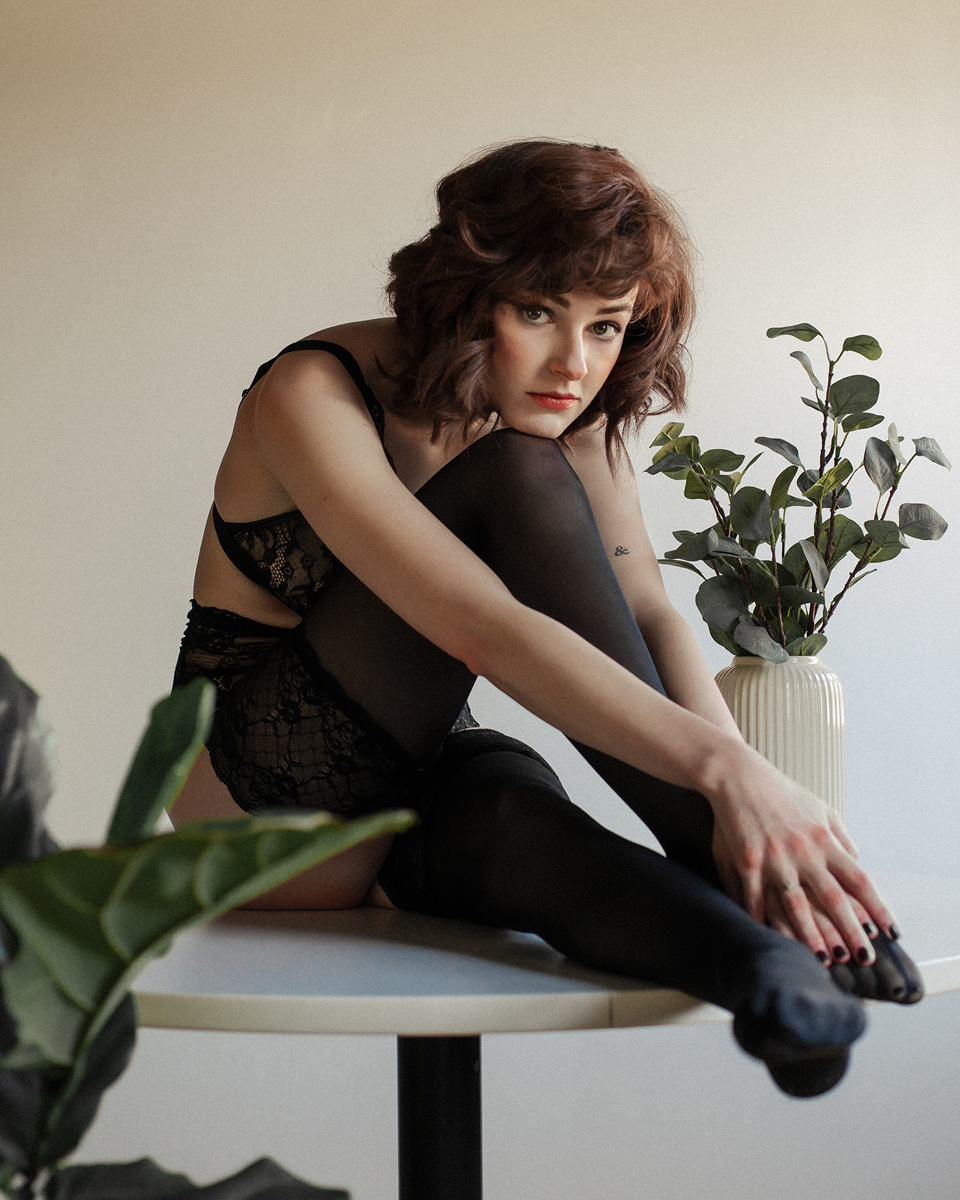
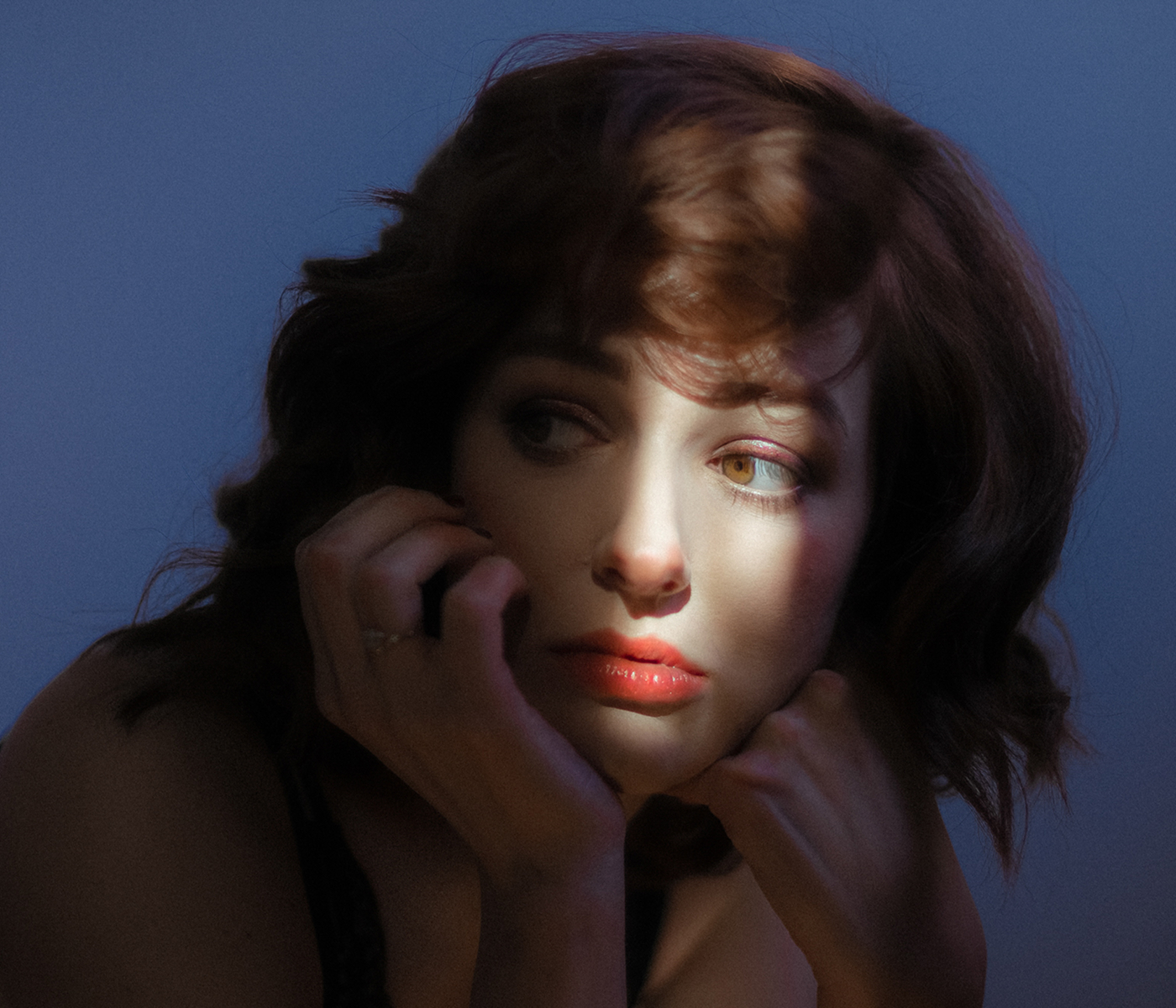
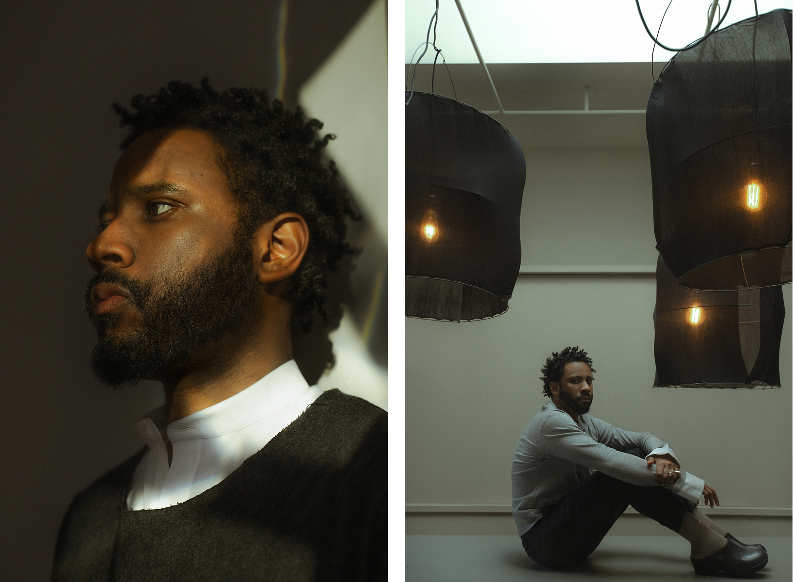
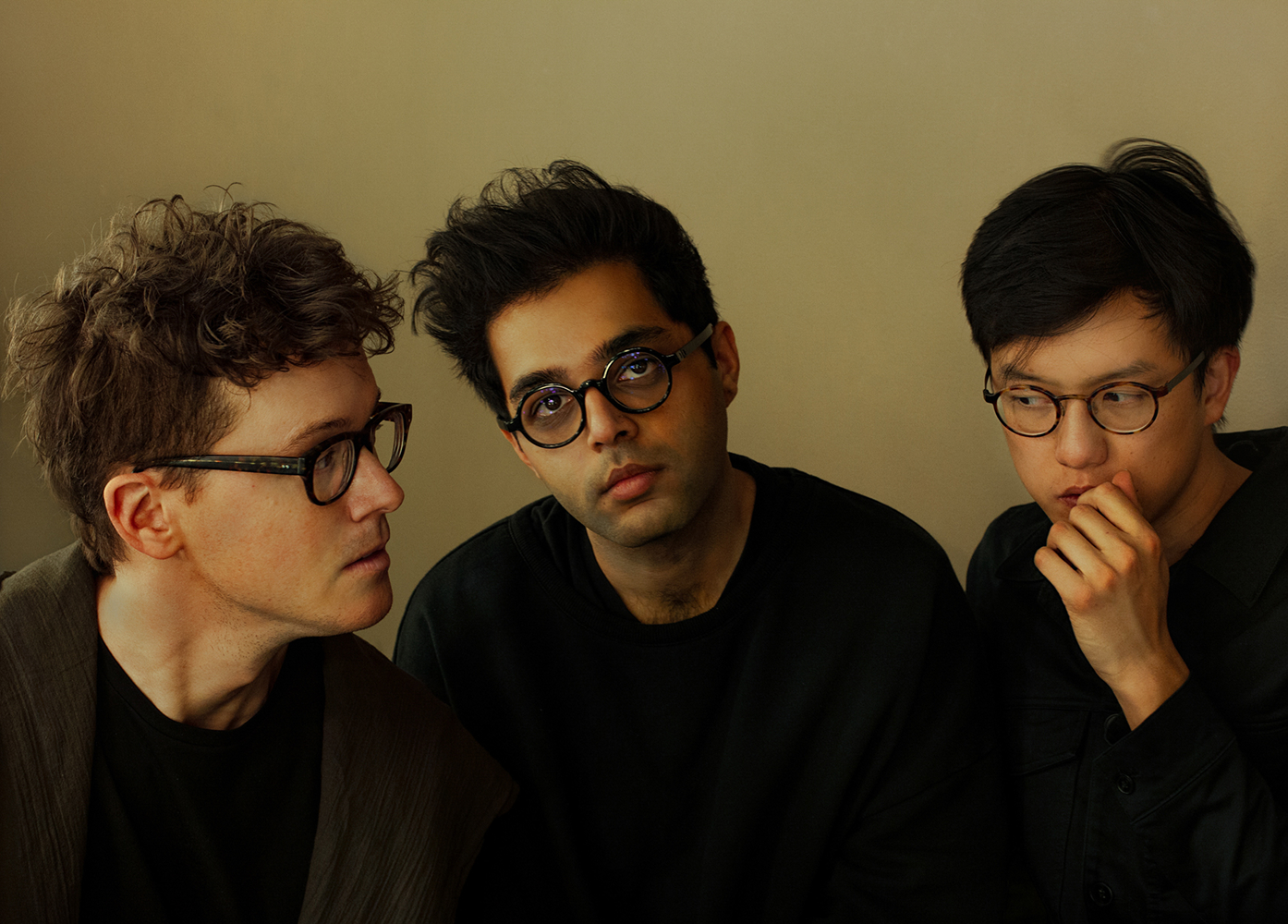
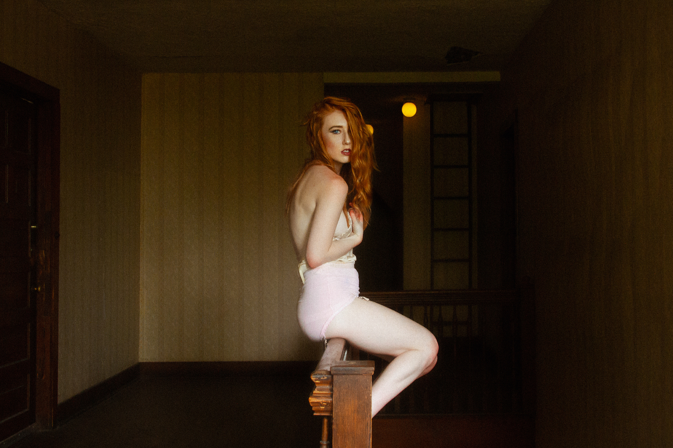
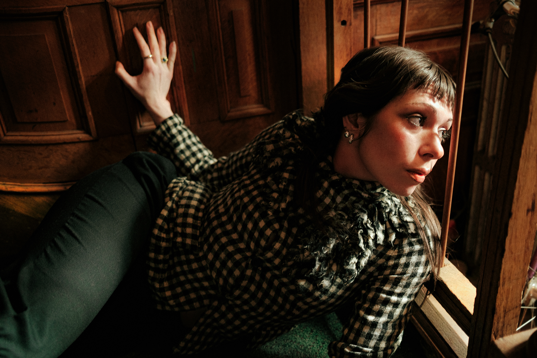
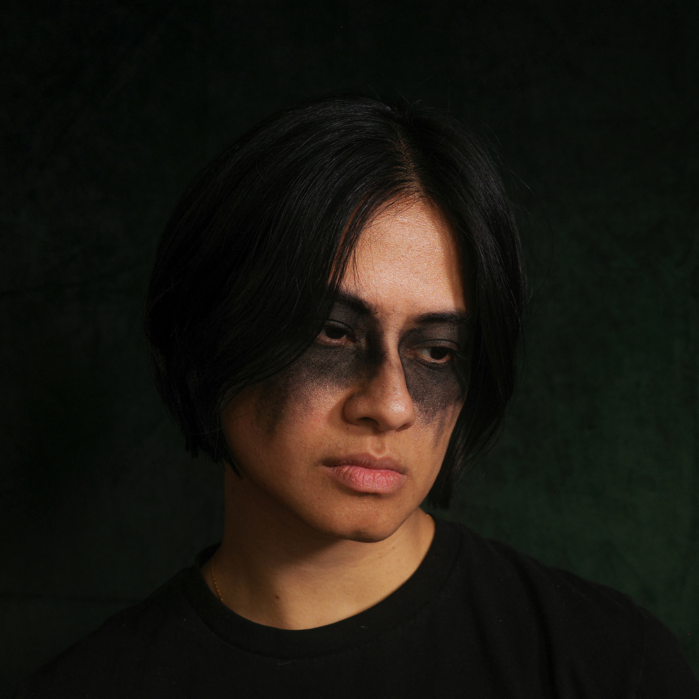
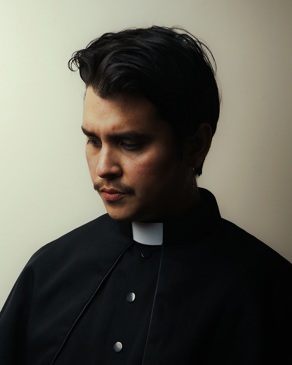
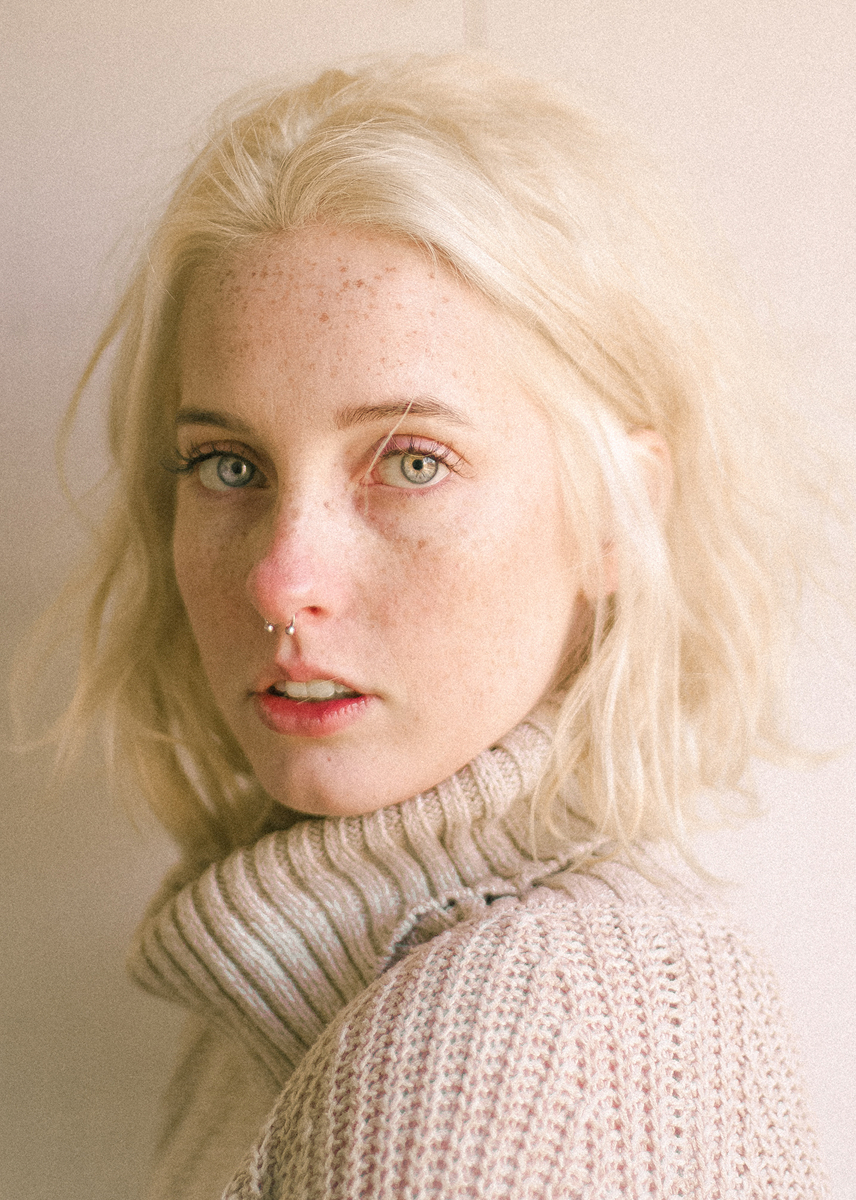
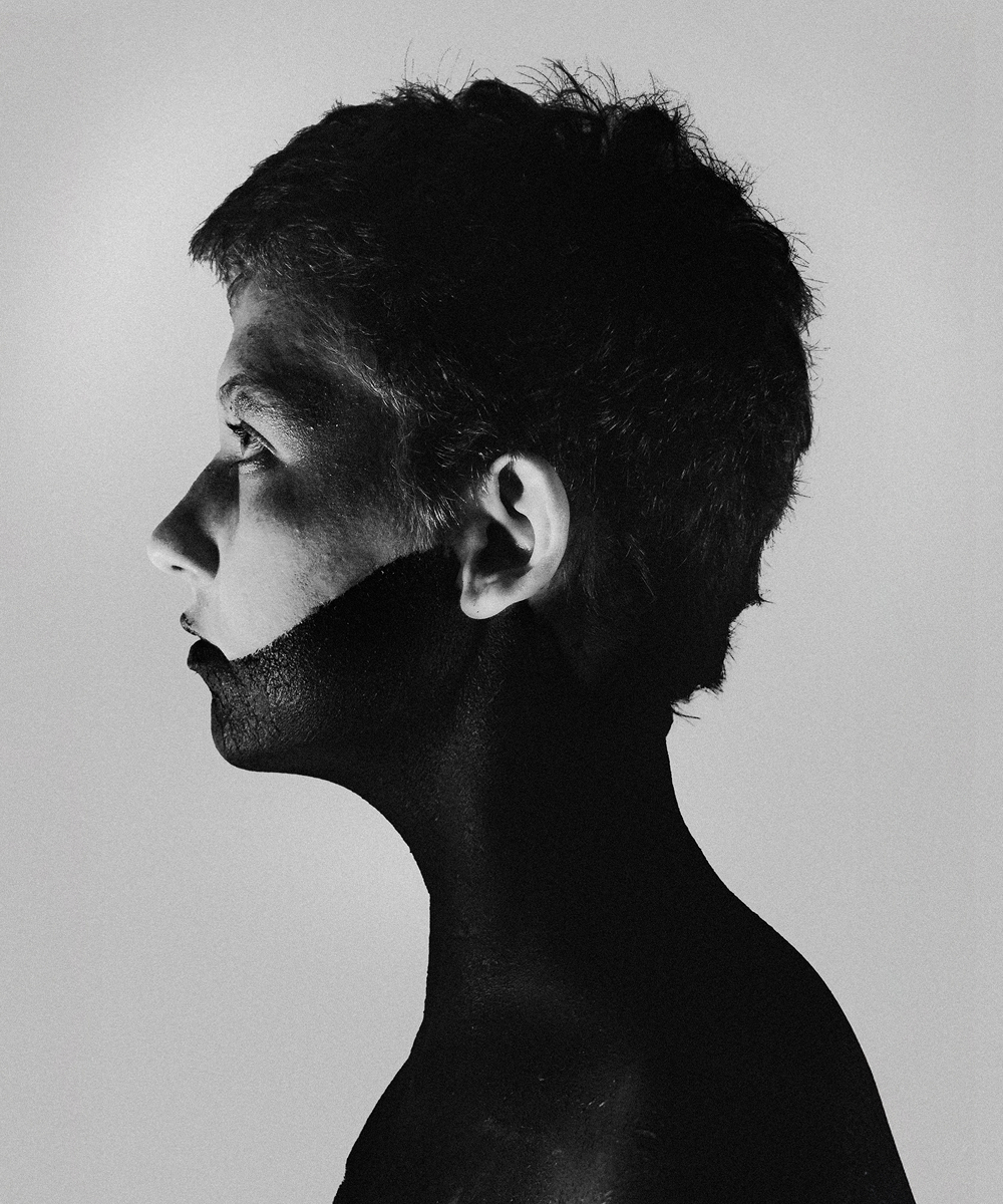
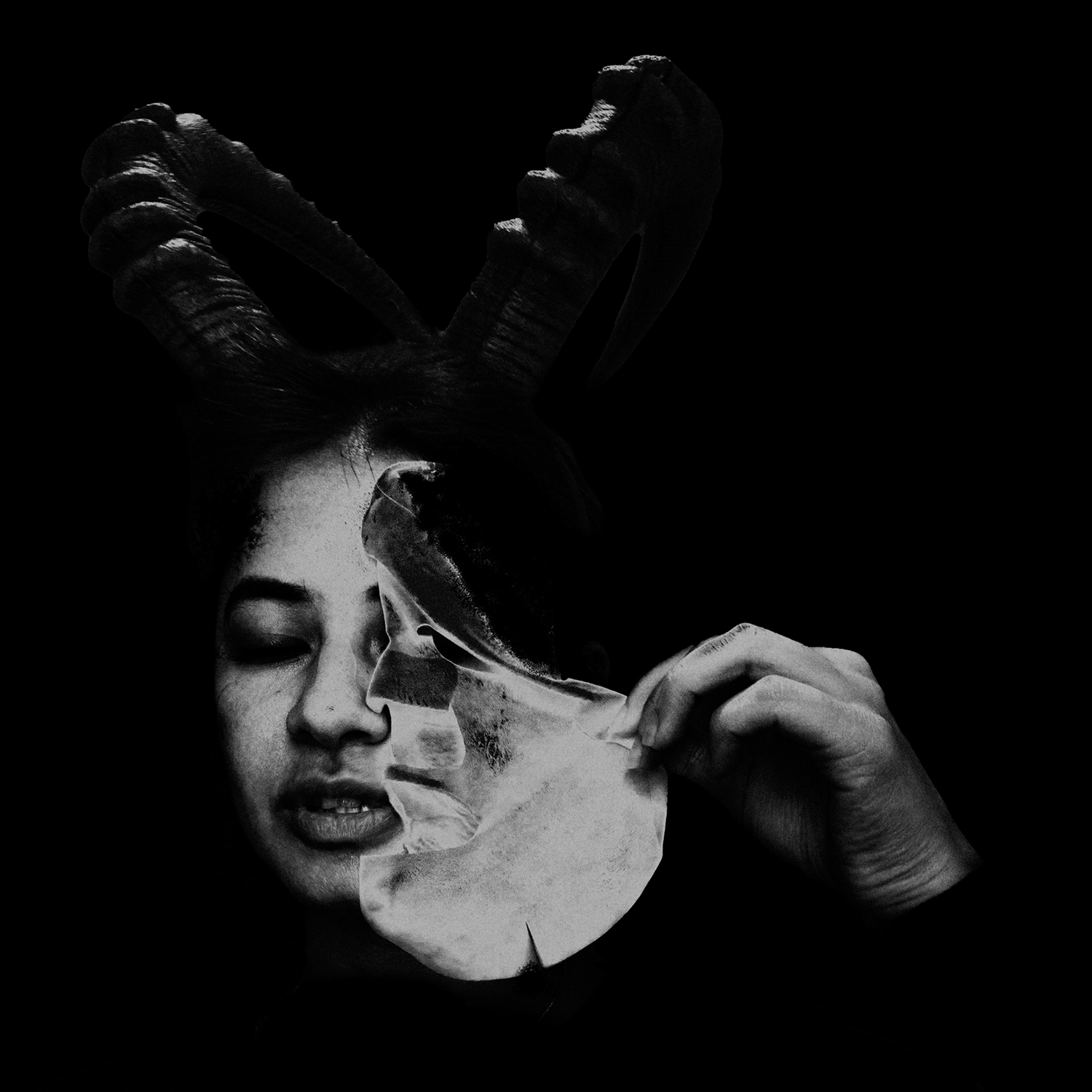
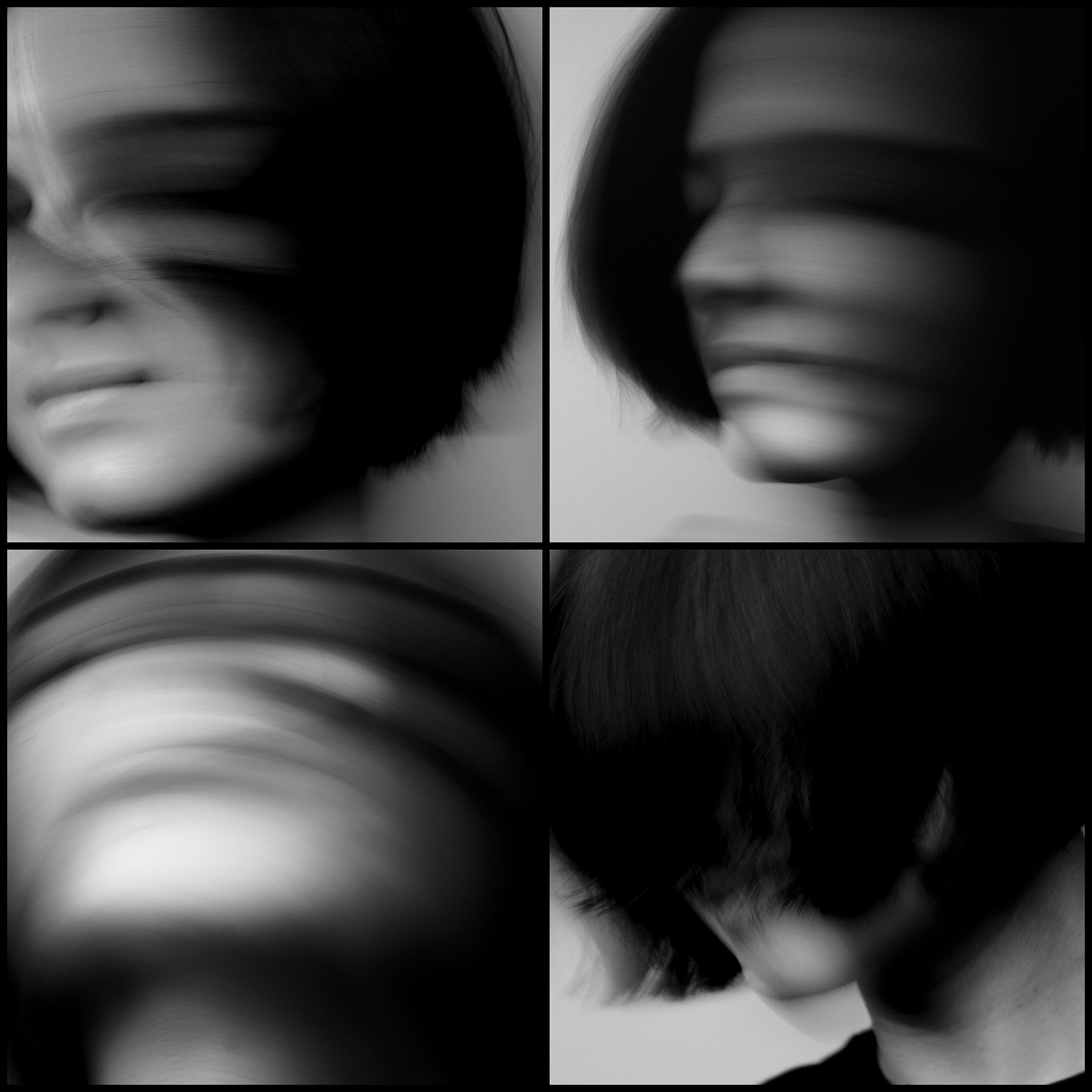
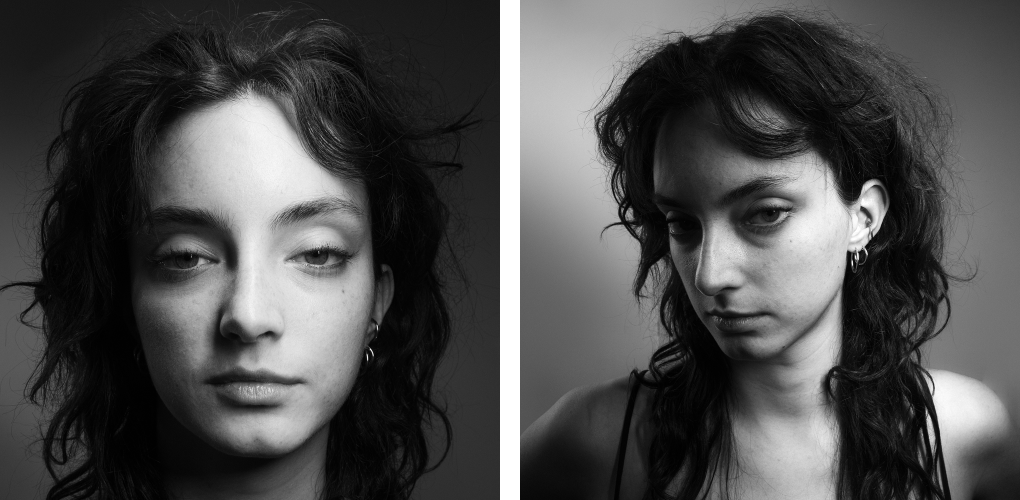
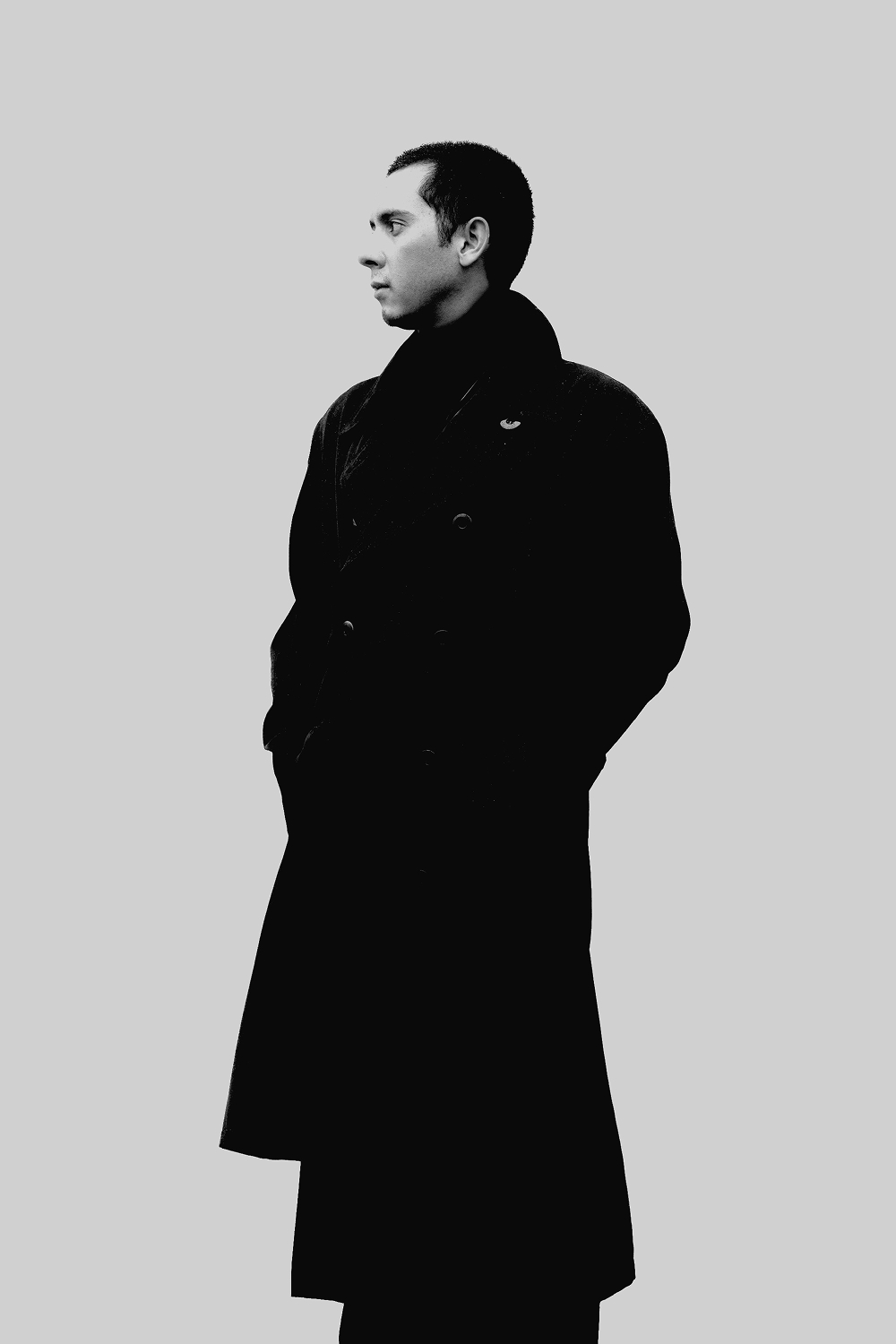
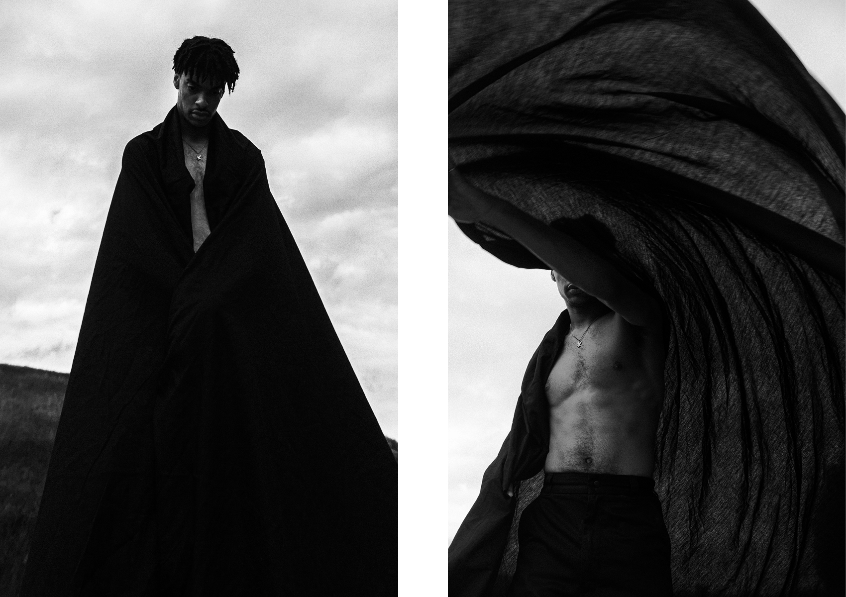
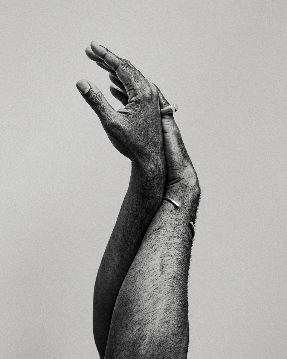
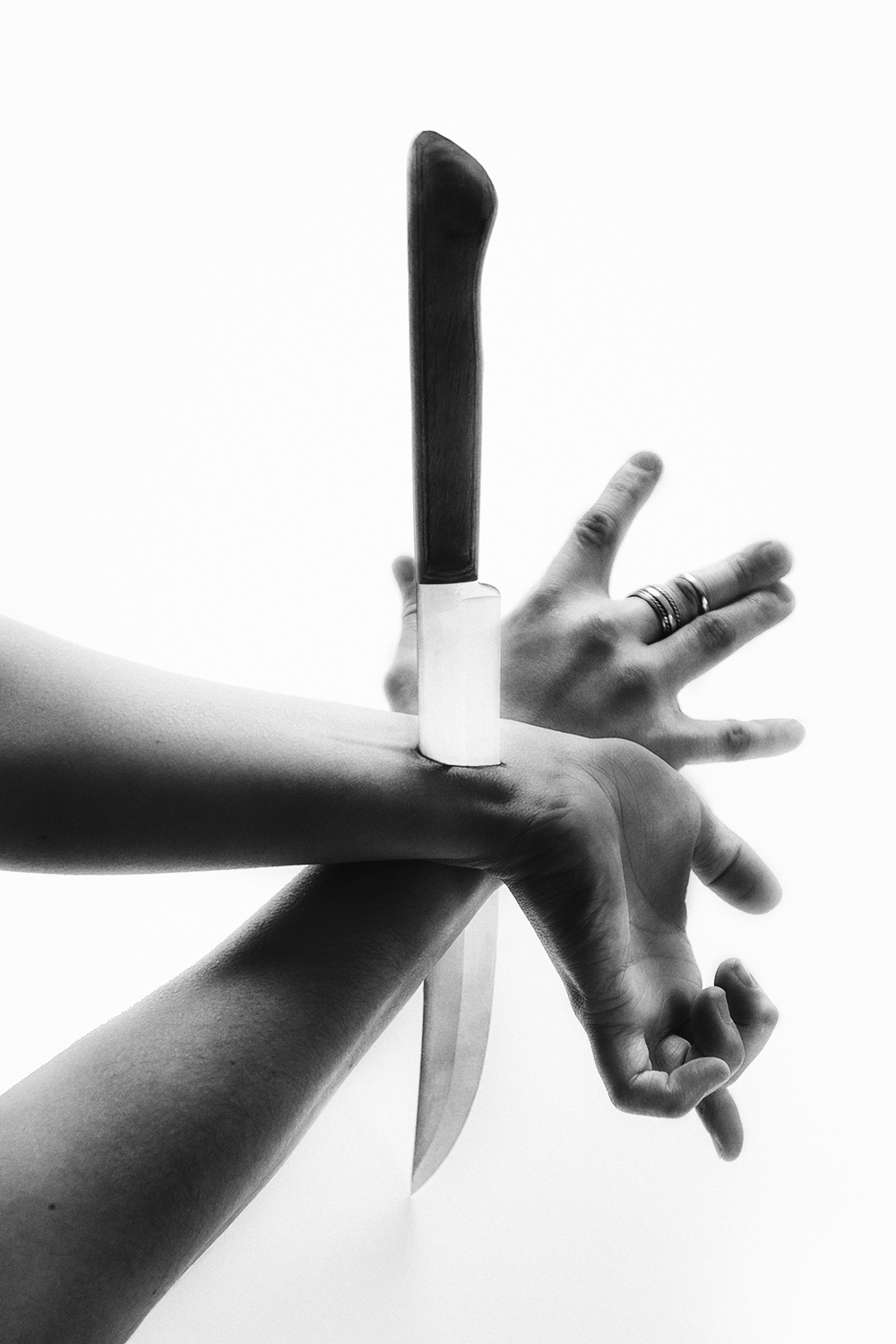
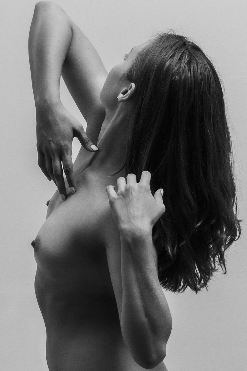
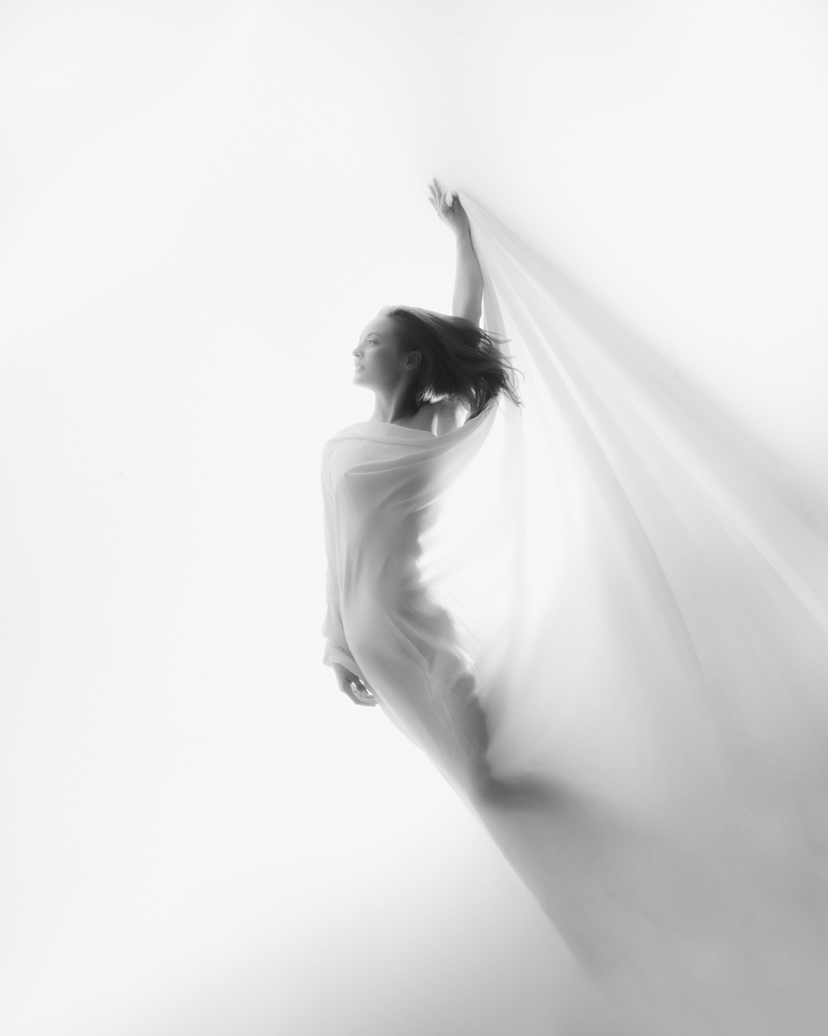
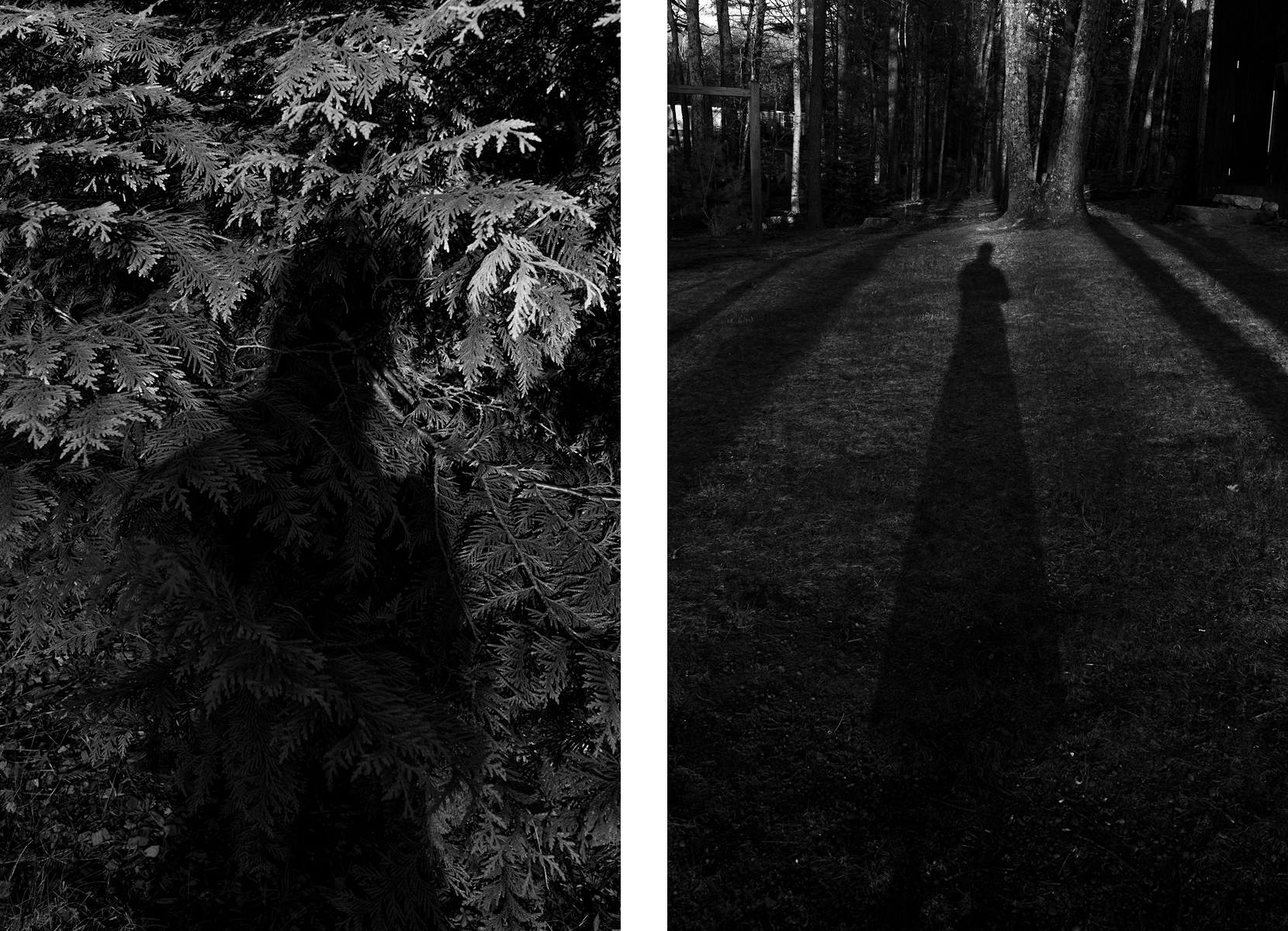
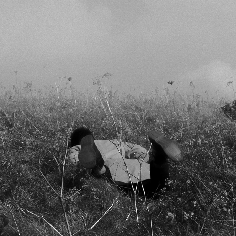
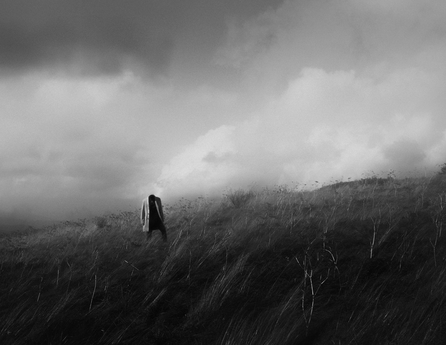
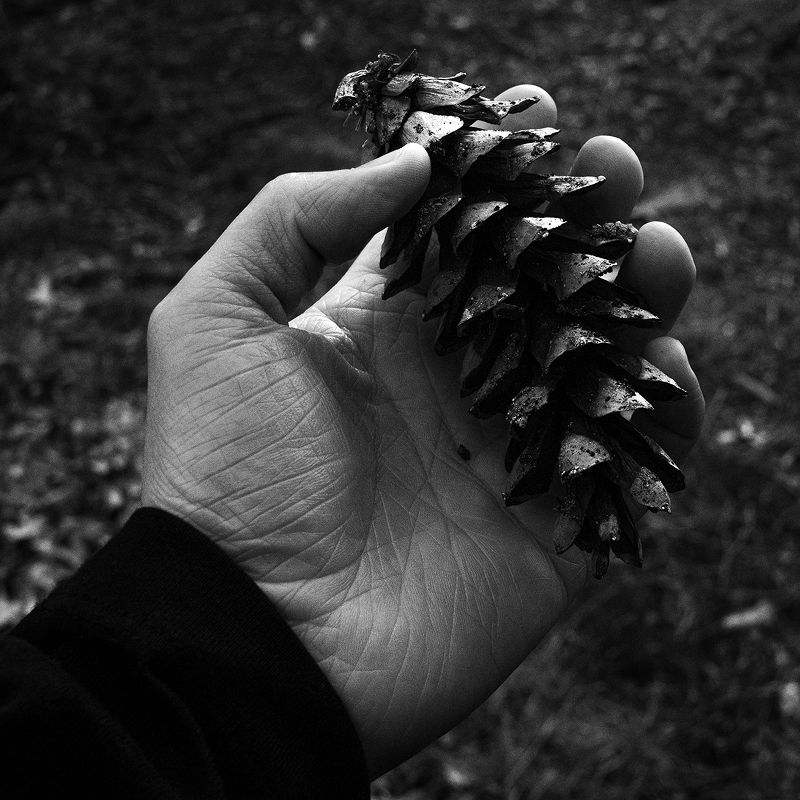
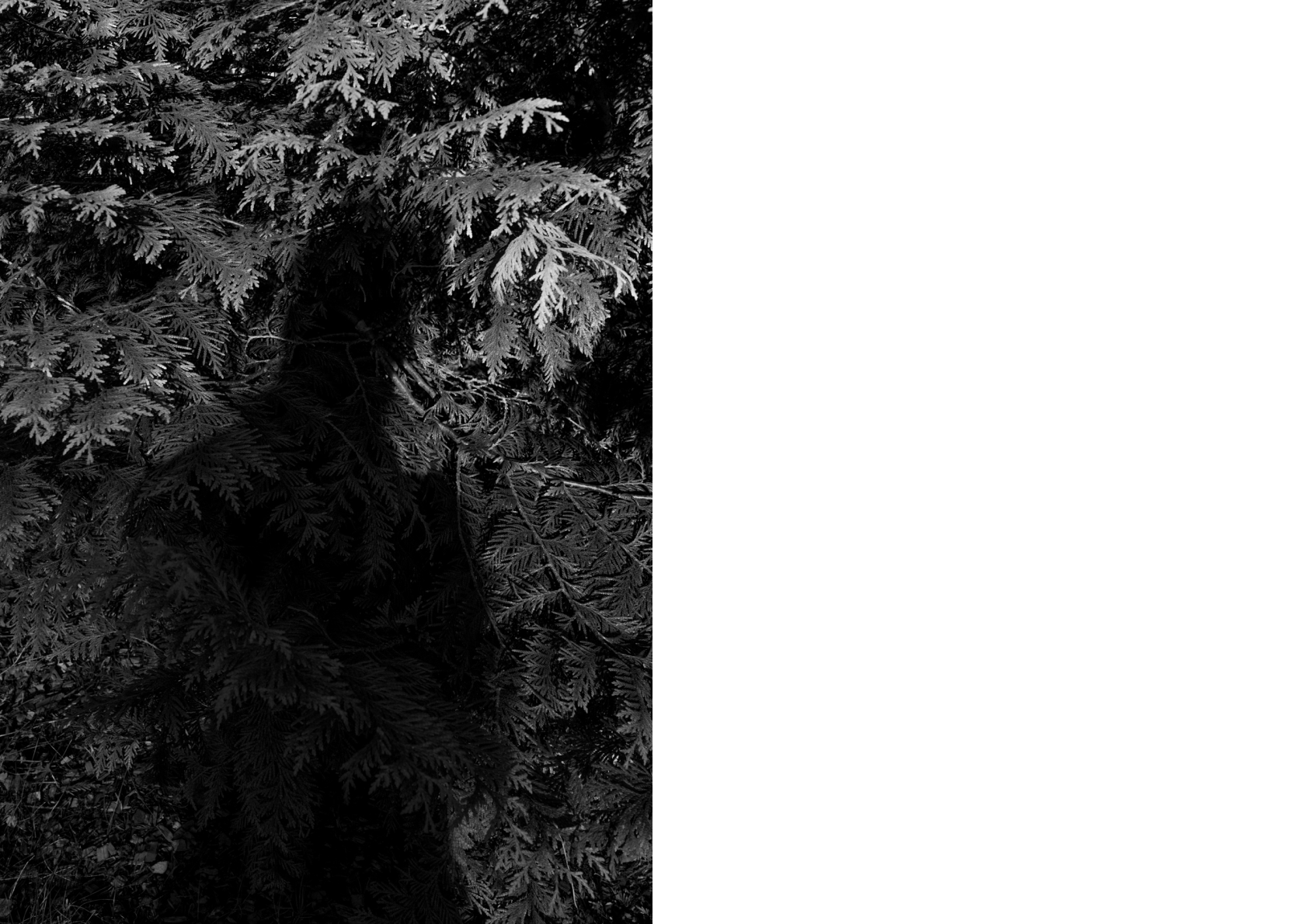
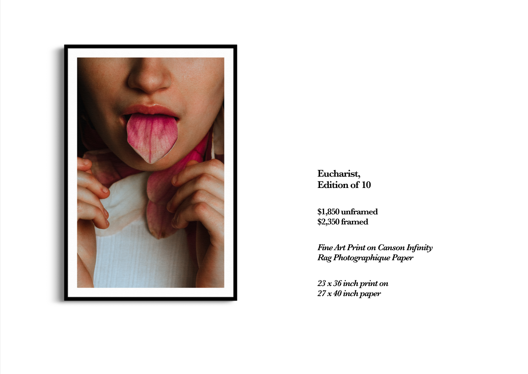
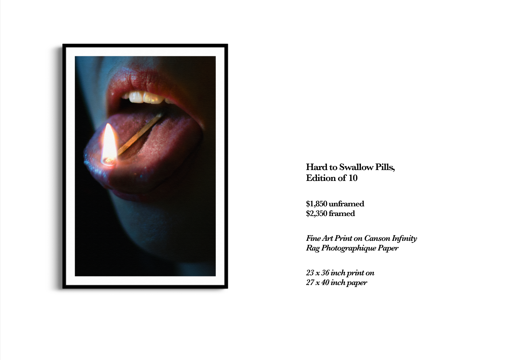
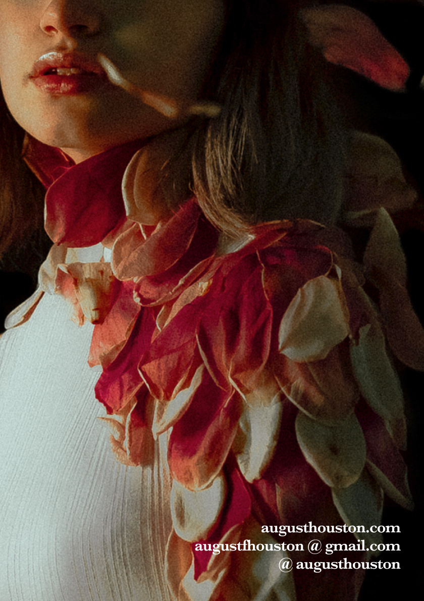
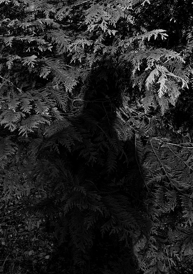
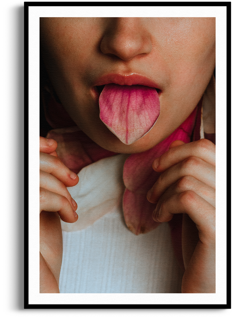
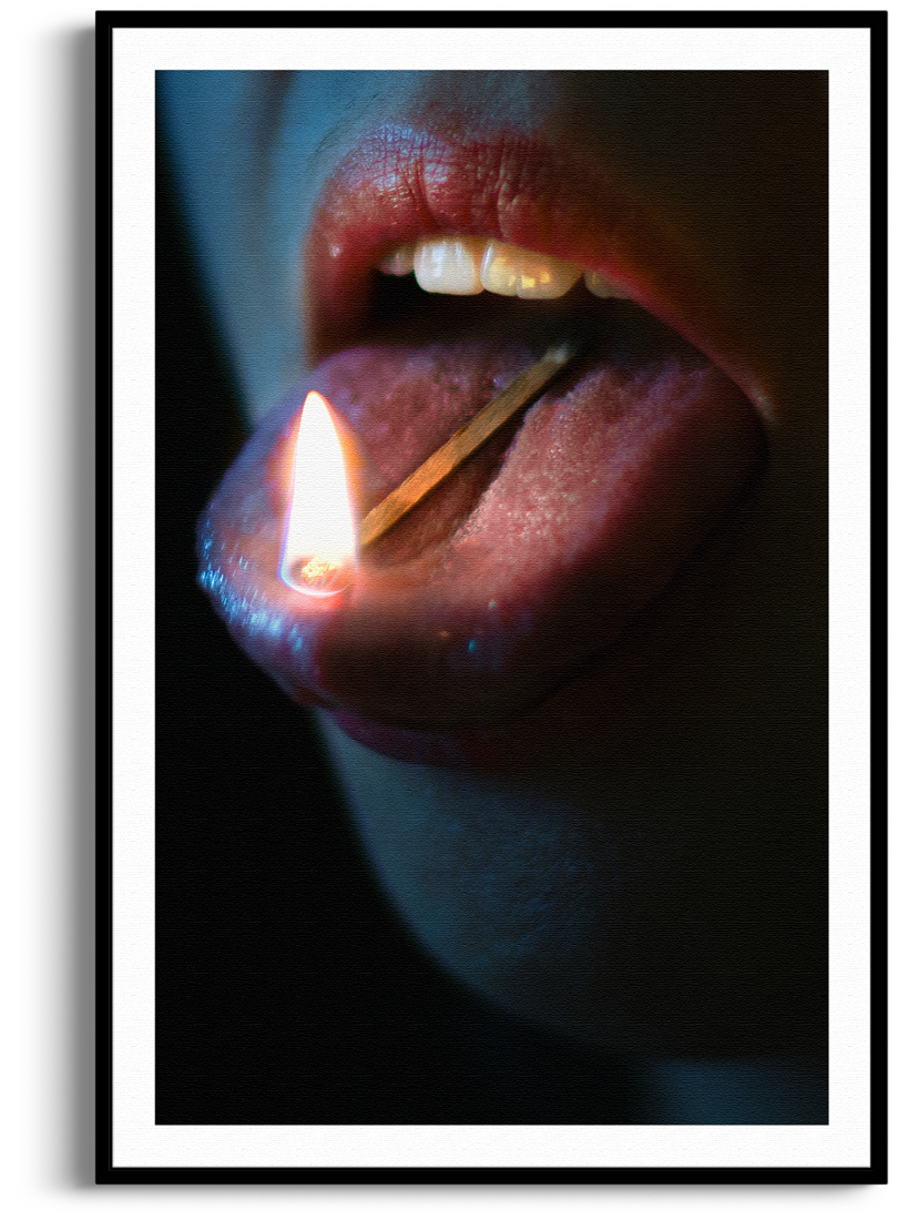
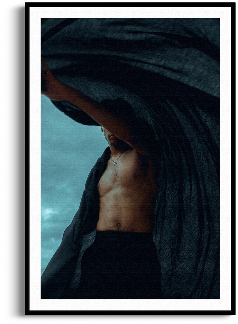
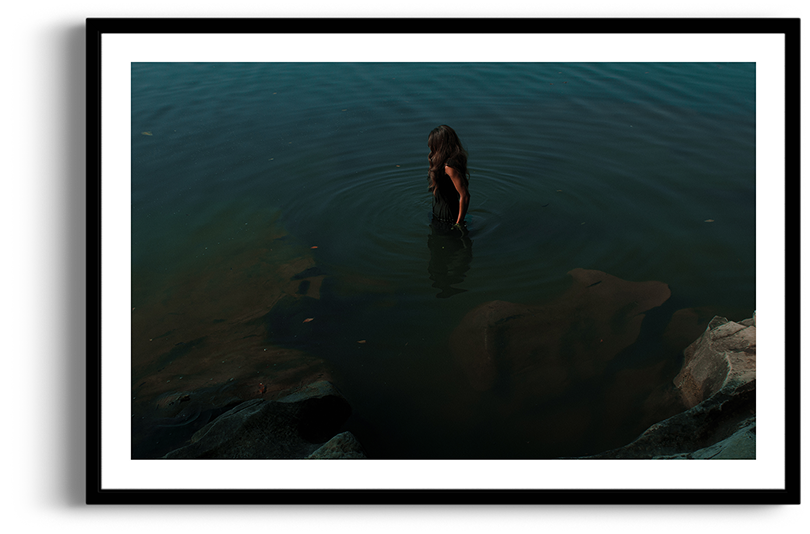
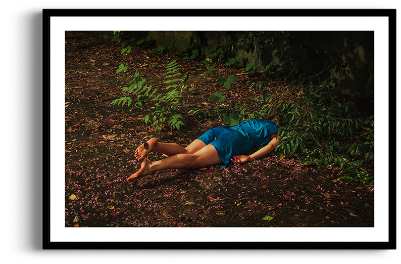
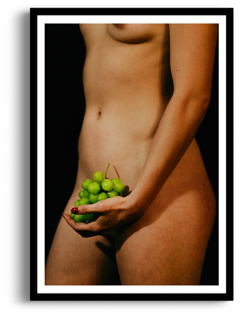
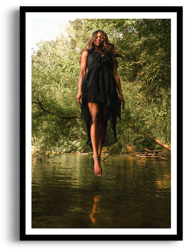
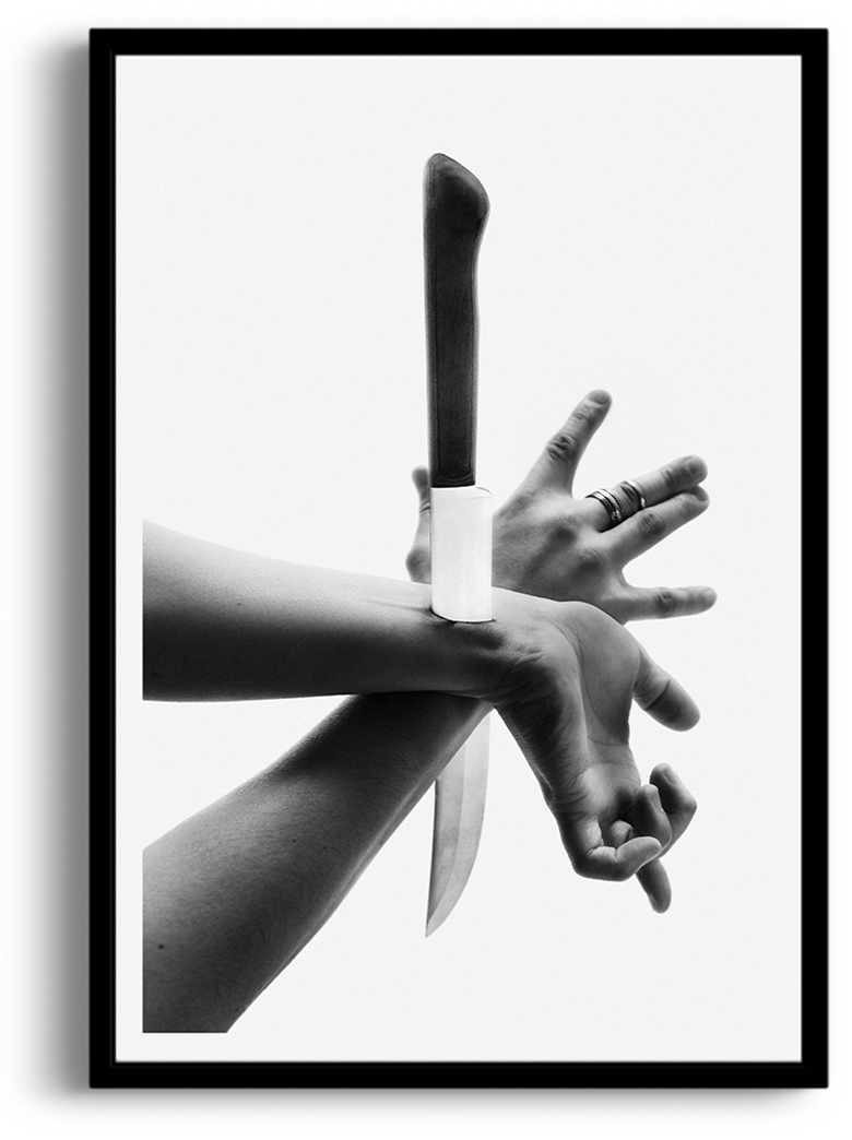
is a Filipino-American photographer and graphic designer born and raised in the American South. His work meditates on truth, love, and failure, capturing moments that feel sacred, fragile, and at times unsettling.

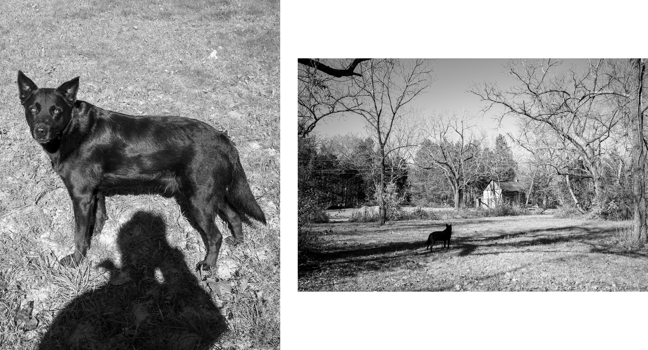
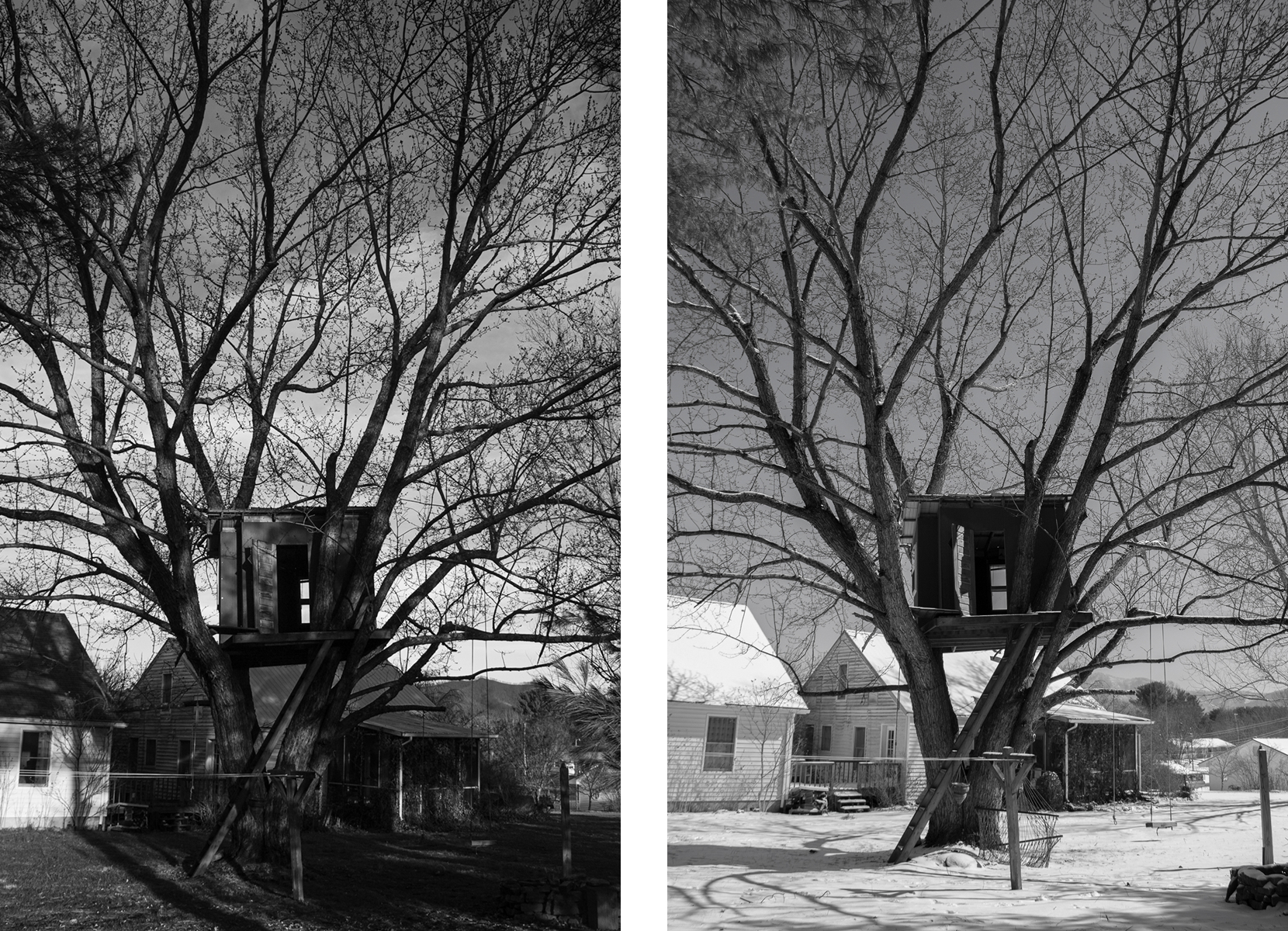
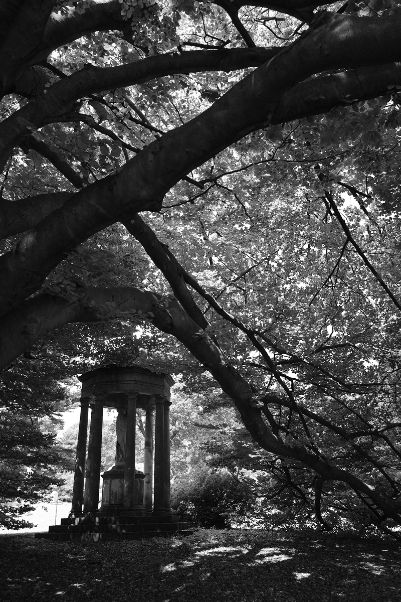
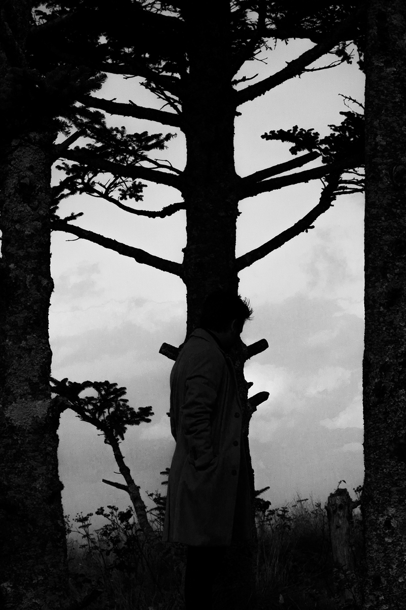
Rejecting modern markers, Houston's work lies in shadow, stillness, and the tension between presence and absence. He builds atmospheres that resonate with discipline and rebellion – echoes of his Catholic and military upbringing. By provoking awe and unease, each piece is a meditation, a pause demanding self-reflection from the viewer.

Houston is based in New York City and holds a B.F.A. in Graphic Design from the University of Tennessee, Knoxville (2017).

BEYOND PHYSICAL THERAPY

The Backstory: Beyond Physical Therapy is a staple in the Knoxville area, but their digital presence hadn't been updated in 24 years. The challenge wasn't just a "refresh"—it was about bringing a trusted, decades-old clinic into the modern era without losing the community connection they had built.

The Strategy: The client wanted to maintain their existing informational structure, so my focus was on elevating the user experience through visual accessibility. I adapted their legacy elements into a clean, intuitive interface designed to serve two distinct audiences: a long-standing patient base that required high legibility, and a new, younger demographic looking for a modern, professional clinic.

The Creative Edge: To truly ground the brand in reality, I traveled on-site to direct and shoot original photography of the team and facility. This allowed me to control the visual narrative—moving away from clinical stock photos to high-impact imagery that showcased their specific attention to detail and patient care.

The Result: By balancing a legacy structure with a contemporary UI and custom photography, I transformed a dated site into a functional, inviting digital flagship. The new platform bridges the gap between old-school reliability and modern healthcare expectations.

ROLE: BRANDING, WEB DESIGN

VISIT SITE ↗

CROSS EYED MOOSE

The Brief: Create a cohesive visual ecosystem for an outdoors-inspired streetwear brand across three seasons of growth. Without a rigid brand guide, I leaned into a raw, utilitarian aesthetic that bridged the gap between the concrete and the trail.

The Process: I began with the Buyer Lookbooks, focusing on a tactile, editorial layout that allowed the technical details of the garments to shine. Because these were for wholesale buyers, the typography needed to be authoritative yet modern. I then translated that "high-street" energy into a single-scroll "drop" site. The goal wasn't just a store—it was a cinematic experience that built tension as the user scrolled, ultimately funneling them to Dillard’s for the final conversion.

The Creative Liberty: The social and digital marketing assets were where I experimented most. I used the "vibe" of the collection to create high-energy, cryptic teasers that prioritized brand "hype" over traditional product photography, ensuring the digital marketing felt as disruptive as the clothing itself.

ROLE: BRANDING, WEB, PRINT AND DIGITAL MARKETING